UGH! Choosing colors for my website is soooo hard!
I hear this from people I work with a lot, and for some, it’s a huge stumbling block. It can be a daunting task for sure. But there are ways to make it easier to come up with colors that you like, that will work well on a website, and will help get your message across.
Colors you use on your website are very important. They can affect how people feel about your company, and even whether or not they’ll stick around on your website. Here are a few tips to help you select colors for your website:
Define Your Brand Personality
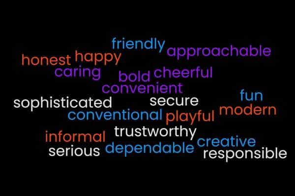
To help determine what colors would fit your brand, make a list of some of the characterisics of your business. Here’s a list of ideas to get you started:
- Approachable
- Bold
- Caring
- Cheerful
- Convenient
- Conventional
- Creative
- Dependable
- Friendly
- Fun
- Happy
- Honest
- Informal
- Modern
- Playful
- Responsible
- Secure
- Serious
- Sophisticated
- Trustworthy
The colors you use should appeal to your ideal client while evoking feelings that match your brand personality. For example, a website for a professional pet sitter might use bright, bold colors to represent the happiness pets bring their people. An attorney, on the other hand, would likely use more subdued colors that reflect the seriousness of their work.
By starting with your brand personality, you can get an idea of what colors will match those characteristics.
Consider the Psychology of Color
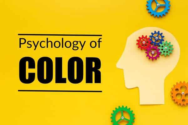
As I mentioned earlier, a pet sitter would likely use much different colors than an attorney. And there’s a reason for this. Imagine an attorney using bright bubblegum pink, a bold purple, and sunshine-bright yellow on their website. It would likely feel a bit off. There’s a reason for that. Different colors have different psychological effects on people. So the colors you use can be a subtle way of making it more likely visitors to your website will feel a certain way about your business. Here are a few examples:
Red – excitement, love, power
Blue – trust, warmth, dependable
Orange – joy, friendliness, success
Brown – dependable, trustworthy, simple
Purple – royalty, luxury, power
Color psychology is a big topic, and this blog post barely even touches the surface! If you want to dive in and learn more, there are plenty of websites that explain color psychology in great detail. If you’re working with a graphic artist, they may be able to help you with this also.
Use a Color Wheel

A color wheel can help you find colors you like, and that will go well together. This means you’re more likely to get colors that will be pleasing on the eye. The last thing you want is colors that clash, causing people to cringe and click away from your website.
Even if you work with a graphic artist, you might want to start with a color wheel. This way you can have a starting point.
Look around for inspiration

Look at other websites in your niche. Notice how you feel when you first land on a website. Does it feel welcoming and like the colors fit with the products or services they’re selling? Do the colors seem to go together or do they hurt your eyes? While you don’t want to flat-out copy their entire color scheme, it’s a good way to get an idea of what would work for your own website.
Choosing colors for your website doesn’t have to be a painful process. If you take time to go through the steps above, I think you’ll find the the right colors without too much difficulty.
Are you building a new website soon?
Geet my FREE Website Design Checklist. it includes 10 things to do before building your website. It will help you focus on what you envision for your final project, making the design and building process go more quickly and smoothly. Click the image below to get your copy.