
You’ve spent hours designing your website. The layout looks great, your services are explained beautifully, and you’ve even added in some adorable animal photos because who doesn’t love a good fluffy face?
But there’s one tiny problem: your visitors are leaving faster than cats when they hear you shake the treat jar. So, what’s going wrong?
It might be your Calls to Action (CTAs). You know . . . those little buttons or links that are supposed to gently guide your visitors toward doing something you want them to do. Here’s the thing: a weak CTA is like ending a conversation with, “Nice to meet you, goodbye.” People just . . . leave.
So, what makes a great CTA, and why is ‘Click Here’ the web design equivalent of wrapping a present in crumpled up newspaper?
What’s Wrong With ‘Click Here’?
Imagine you walk into a bakery, and instead of delicious-smelling pastries and friendly staff offering free samples, you just see a big, bland sign that says, “Come in.” No description, no enticing language, nothing. Would you feel excited about trying what they offer? Probably not.
That’s what ‘Click Here’ does to your website visitors. It’s boring, vague, and doesn’t even hint at what will happen next. And, you know as well as I do, people are impatient nowadays! We want to know exactly what’s in it for us before we even consider clicking.
Using ‘Click Here’ is like a one-size-fits-all approach. But seriously, how often does one-size-fits-all actually work? Not often! A ‘Click Here’ button is pretty much the same. It doesn’t create anticipation, urgency, or excitement. Worst of all, it’s missing an opportunity to show off your brand’s personality.
Why Your CTAs Matter More Than You Think
Your CTAs are more than just buttons or links. Think of them as an invitation. They’re your way of telling people what to do next and, more importantly, why they should do it. A well-crafted CTA guides your audience, like leading a golden retriever to a bucket of tennis balls.
More importantly, they’re your chance to engage your visitors and keep them from bouncing away like caffeinated squirrels. If your CTAs aren’t enticing or clear, you’re likely to lose a potential client because they just don’t feel compelled to take any action.
Not only do CTAs influence conversion rates, they also help shape user behavior. People expect to be guided when they land on a website. A CTA gives structure to your content and helps them reach their goal, which will lead to them being a new client or customer. And THAT is precisely why you have a website!
Elements of an Irresistible CTA
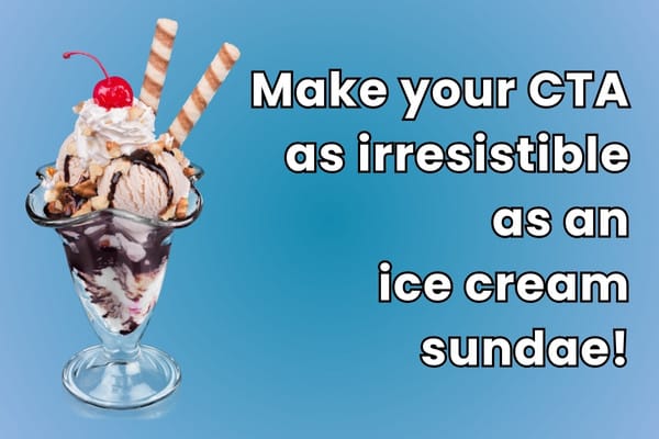
So, how do you craft a CTA that’s as hard to pass up as an ice cream sundae? Here are the essentials:
1. Be Clear and Specific
Vagueness is the enemy of good CTAs. Instead of ‘Learn More,’ try ‘Discover Our Dog Walking Services.’ Make sure people know exactly what they’re getting.
If your offer is a downloadable checklist, say so. If it’s a consultation, say what kind of consultation. Instead of “Get Started,” try “Get Your Free 30-Minute Website Review.” Let people know exactly what’s coming after the click.
2. Use Action Words
Your CTA needs to convey action. Use action words like ‘Download,’ ‘Get,’ ‘Try,’ ‘Find Out,’ or ‘Schedule’. This makes people feel like they’re actively doing something – and getting closer to their goal. After all, they came to your website for a reason. Passive language leads to passive visitors, and passive visitors rarely become clients.
Bonus points for combining verbs with benefit-oriented outcomes. For example, “Download the Guide to Doubling Your Bookings” is much more exciting than just “Download Now.”
3. Create Urgency or Exclusivity
Adding a little urgency can work wonders. ‘Book Your Spot Now’ or ‘Grab Your Free Guide Before It’s Gone’ can nudge people into action. Just be careful not to sound too pushy. You don’t want to sound like a used car salesman or a desperate telemarketer.
If you have limited spots, say so. If your offer expires soon, include a countdown or date. This taps into a little psychological principle known as FOMO, which can be effective.
4. Make It Stand Out Visually
Your CTA needs to be as obvious as a neon sign. Use contrasting colors, larger fonts, and whitespace to draw attention to your buttons.
And don’t just bury your CTA at the bottom of the page. It’s actually a good thing to include multiple CTAs if your content is long. Just make sure each one is relevant and fits the flow of the content.
5. Stay On-Brand
Your CTAs should match your brand’s voice and personality. If you’re a pet sitter with a playful tone, try something like ‘Paws Here to Learn More.’ If you’re a serious consultant, ‘Let’s Talk Strategy’ might suit you better.
Your CTA is an extension of your conversation with the user. Keep it in the same tone as the rest of your website, and friendly yet direct.
CTA Placement: Where You Put It Matters
It’s not just what your CTA says, where it lives on your site matters too. Common locations include:
• Top of the page (above the fold)
• After a compelling testimonial
• At the end of a blog post
• On your services or about page
You want to place CTAs where your visitor is most likely to be ready to act. For example, right after you’ve shared success stories or clearly outlined a benefit of your service.
Examples of Click-Worthy CTAs
To help get your creative juices flowing, here are some examples of CTAs that are miles better than ‘Click Here’:
• 🐾 ‘Fetch Your Free Guide’ (For a pet training service)
• 📅 ‘Book Your First Session Now’ (For a coaching business)
• 🌟 ‘Start Your Free Trial and Fetch Results’ (For a marketing tool)
• 🐶 ‘Snag Your Spot Before It’s Gone’ (For a dog walking service with limited availability)
• 🎯 ‘Claim Your Free 20-Minute Strategy Call’
• 💬 ‘Send Me the Tips!’ (for a newsletter opt-in)
Common CTA Mistakes to Avoid
Before we wrap up, here are a few CTA blunders to avoid:
• Being too generic: ‘Click here’ or ‘Submit’ doesn’t cut it anymore.
• Hiding your CTA: If visitors can’t find it, they can’t click it.
• Using too many CTAs: Don’t overwhelm your visitors with 14 different buttons. Keep it focused.
• Not aligning the CTA with the content: Make sure the offer makes sense in the context of what your visitor just read.
• Skipping mobile testing: CTAs that look great on desktop might be impossible to click on mobile.

Think of your CTAs as an invitation!
Your CTAs are your digital invitations. They should be enticing, clear, and matched to your audience’s needs. It’s not just about getting clicks; it’s about guiding people to take the next step. If you sent out invitations to a party, you’d probably want to make them so people were excited to attend. Your CTAs can do the same thing!
So, ditch the boring ‘Click Here’ and replace it with something that shows your brand’s personality and gives people a reason to take action. After all, you’re not just trying to say ‘hello’. . . you’re trying to start a conversation.
And who knows? The right CTA might be all it takes to turn a curious visitor into your next loyal client.
Need help writing CTAs that actually work? Whether it’s your homepage, service page, or blog post, I can help you create buttons that convert. Reach out if you want to chat strategy — no boring “click here” buttons involved!